Mobile optimization is one of the biggest missed opportunities in email marketing. Whether you’re sending out email nurtures or a newsletter, there are a variety of little tips and tricks you can count on to help ensure your email doesn’t just miss the dreaded spam folder, but also gets clicked and read!
Improving your email should be a priority, but where exactly do you start? Well, we’re glad to inform that this article was made for you. Our goal is to provide the information you need to take that leap into the world of optimized emails. So, here’s a “table of contents” for you to tab through as you begin your journey:
Email responsiveness: why does it matter?
Over the last few years, marketers believed that email was going to be a thing of the past. They even said, “Email is dead.” But the reality is that email has revived and transformed itself into an invaluable tool for just about everybody.
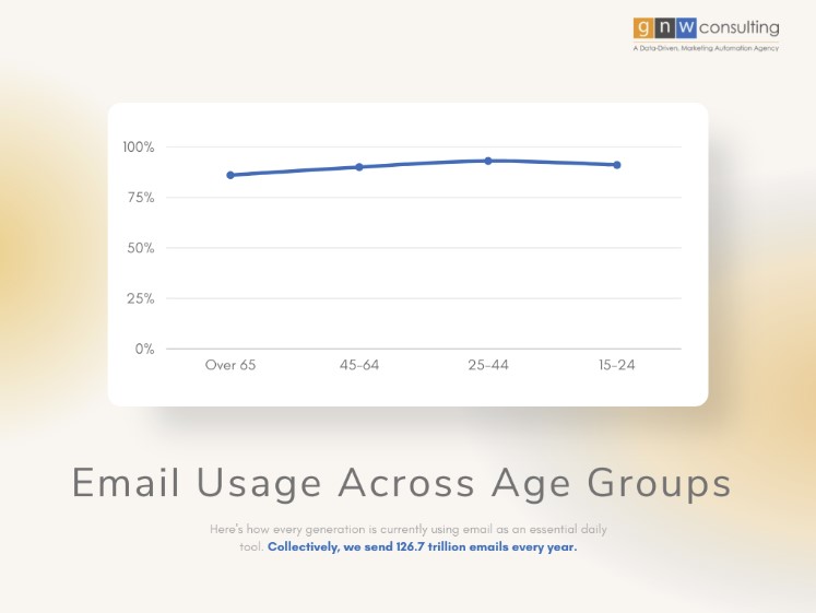
From Gen Z, to the boomer generation, 90% of all Americans still use email to communicate. People check email not once or twice a day, but multiple times throughout the day. In fact, some say they check it immediately after waking up.
So, as you can see… a lot of emails are sent every day by everyone and its important to make sure that they’re captivating and most importantly useful. People rely on being able to communicate efficiently and gather the information they need from receipts and itineraries to dinner reservation details and e-cards, each email is an opportunity to delight customers along their journey and retain them for the long haul. In short, responsiveness is the only way to bring audiences what they’re looking for via email.
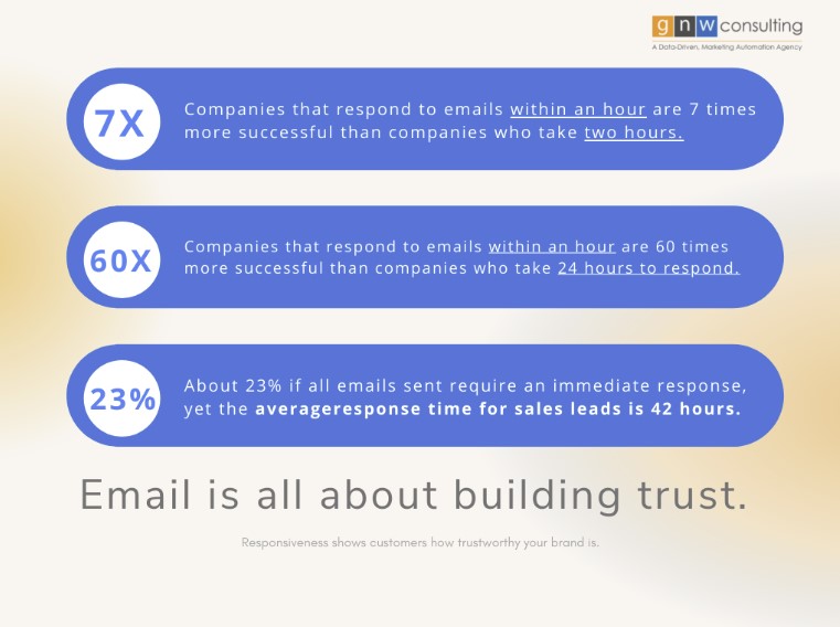
That’s right, email responsiveness is all about building trust. Automation (think: autoresponders and quick replies) is one way to ensure that you’re always responsive. But, what does that mean? It means you’re responding efficiently, but it also means your email is well-formatted and easy to find in even the most cluttered inbox. Each audience expects different response rates, but as a general rule, about 30% of all email senders expect a response within one hour.
Having the customer service infrastructure to ensure a timely response isn’t just about putting hands on keyboards, it’s all about leveraging the tools at your disposal to segment and flag emails accordingly to build a customer base for life. The longer the response time, the less interested and frustrated the customer is.
Not entirely convinced why email is such an integral part of your business? Here are a few stats that may help drive the message home:
Pre-header: The Do’s and Do Not’s
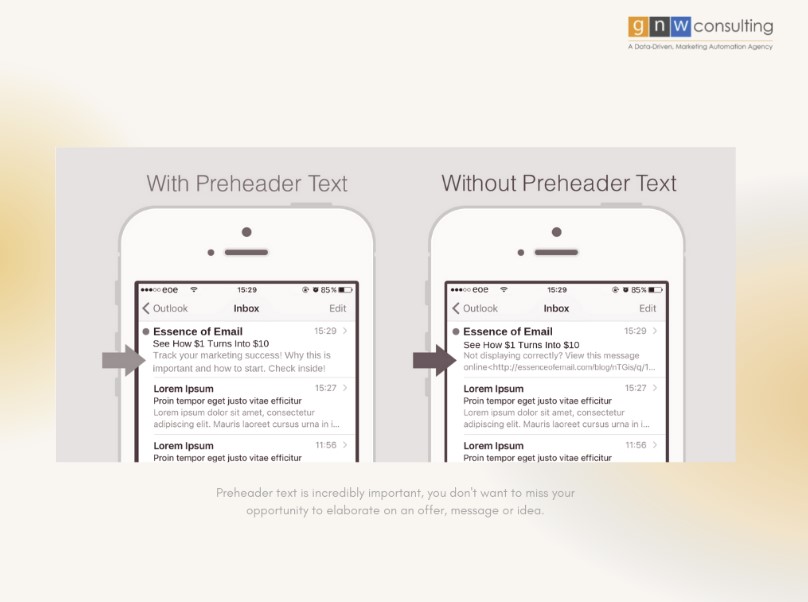
While this may seem like a small detail in the grand scheme of email, it can really make or break your inbox game. One thing to clarify – since we often get this question – pre-header text is the copy that is visible in a user’s email client after the subject line. It’s usually the moment when users decide if they want to continue reading the email or not.
When it comes to best practices, the most important do is to stay short and succinct and the second most important is to be informative and eye-catching. Focus on making your email more snack-worthy, rather than the entire email. These are the basic do’s and don’t’s of snackable email:
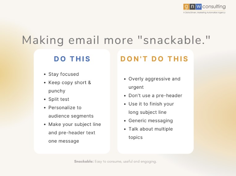
We also recommend split testing multiple variations to find out what works with your audiences. Personalization starts in their inbox, so remember to implement it where it makes sense to increase conversion. A personal touch can sometimes mean the difference between a click or no click, so take a chance and test some different messages, but be sure to always remember to stay focused and concise.
“Our go-to is to test making the email subject line and preview text one connected message. It’s the best place to elaborate on your subject line and provide the extra detail users need to pique their interest. It’s also the tactic that gets the highest open rates. “ - Raja
Optimize Across Devices
We think this is often a little misunderstood because we don’t mean to make sure you’ve got a desktop and mobile version, but rather to have a design or template that is truly responsive across all clients AND tablets. Just as you would have breakpoints for your website, you’ll need to consider how your emails are filling the screen of any device, whether it’s an iPad or iPhone.
The worst user experience within an email is having to scroll left or right, or zoom in and out just to see the whole email – it discourages and frustrates everyone, and no they won’t suffer just to read more about your offer or copy.
✏️ While you can always create your own unique design, we recommend always testing across devices using services like Litmus to make sure your email will be seen in its best possible format, no matter where it is seen.
🧠 Our biggest recommendation for this topic? Simply use a single-column layout because this ensures your email has easy breakpoints and also saves you time (and a huge headache) optimizing and testing!
🛠️ Another tool at your disposal to help optimize your emails is to use device detection. Device detection allows you to create dynamic elements within an email that can change in real-time depending on the device. You can use this as a tool to personalize or a tool to optimize and rather than creating a million versions of the same email, you can mix and match sections based on segmentation or device type.
Focus on simplicity & clear CTAs
To put it simply, keep your email short. The shorter it is, the better it will perform, especially on a mobile device. Don’t forget to mix it up, users shouldn’t be met with a wall of text, but they also should not just see a huge image take over their entire screen.
These are a few tips to help you stay concise and focused, while still delivering a creative, worthwhile message:
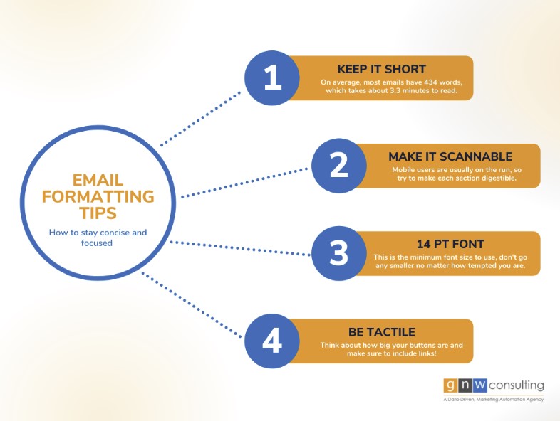
Don’t forget to bring your best CTA copy, after all, the user journey begins with your email. You want to lead with the CTA as early on in the copy as possible. Use buttons instead of links where it makes sense, but don’t overuse your button power, you’ll want some links in there for the more attuned readers.
“When it comes to simplicity, the key is remember that white space is your friend. You want to make the most of your design and enhance the mobile UI as much as you can, but white space is what makes this possible.” - Raja
Always Be Testing
It doesn’t matter if you follow all the rules – if a mistake can happen it will happen. Test your message, use your email service provider’s tools to detect issues and to see how it looks across devices. If you want to take an extra step, send the email to your own address to make sure everything is legible and your CTAs are where they need to be.
Test your links, the first link in a responsive email has a 30% higher click rate than a non-responsive email, so be sure you’re leading users where they need to go. We always recommend using multiple tools to make sure your email is up to snuff. Whatever you do, always be testing.
Get a Free System Audit
Wondering why your emails aren’t performing up to par? We offer a free discovery session to discuss your marketing automation platform and ensure everything from campaigns to workflows and programs are operating as best as they could.
Our team wants to help take your email game to the next level, so if you want to gain an even deeper understanding of how your marketing operations are working for you, engage in a marketing sensitivity analysis for the most in-depth feedback of all.