Testing can be scary. After all, you’re trying to accomplish thing you’ve never tried before, but we’ll help you find the path to success, every step of the way.
Just follow these simple rules and stick to the methodology to ensure you’re still coloring within the lines, even if you do take a few liberties.
Throughout this eBook, we’ll focus on four main optimization areas:
You can expect some advice on what to do and what to stay away from. We suggest that you keep your campaign goals in mind when optimizing your campaign, but always attempt to test and learn.
Learning is always a best practice at any point of your career.


Choosing the Right Tactics
How do you formulate a testing strategy?
Choosing the right methodology is all about knowing how and what you want to test. Lucky for you, the most popular testing strategies happen to be very straightforward.
Introducing: A/B Testing
A/B Testing can help you determine how your campaign changes are performing. You focus on just two variables. Let us explain.
So, What is A/B Testing?
It’s a form of split testing which compares two versions of the same campaign on a preferred channel.
These channels could include – but are not limited to :
- A Website or Landing Page
- Social Media
- Paid Search
- Mobile Apps
- Emails
- Digital Ads – Banners, Video, etc.
Why do people A/B test?
There are 3 main reasons why people A/B test:
- Different Audiences respond to different things. It’s not always the best-designed email that wins. Sometimes your creative assets just need to be tested.
- It’s one of the easiest ways to determine exactly what is working and what isn’t.
- You can virtually test anything, from copy to UI/UX or even a simple button color change. You name it, then test it.
Benefits of A/B Testing
The A/B Testing framework can help you understand the robust impact minor changes can have on your campaign performance.
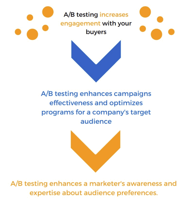
Source: Why A/B Testing Works [Benefits of A/B testing in campaigns]. (n.d.). Retrieved from https://www.marketo.com/resources/
How do you begin testing?
The testing framework is simple and comprised of 8 steps. Ensure you follow them in order for optimal success.
This Testing Framework will ensure you can quickly pick up the knowledge necessary to gauge the performance of your campaign. You can always repeat this process with any campaign and any variable to effectively enhance your audience understanding.
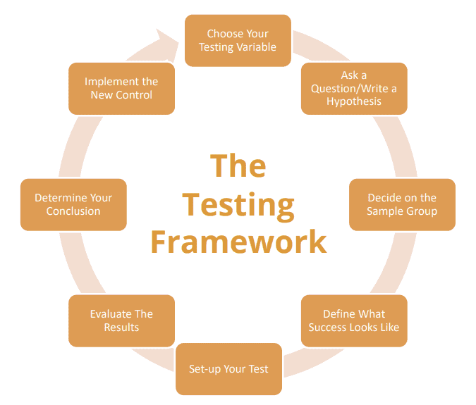
Source: Marketo’s A/B Testing Workflow. Retrieved from https://www.marketo.com/resources/

Optimize Your Emails
How can I make sure someone sees my email?
This is surely the most common way to optimize your campaign, with good reason. Simple emails can have a complex strategy behind them with multiple considerations such as images, color, CTA placement, and
more.
While these features can often be part of the overall design, sometimes a visually ‘pretty’ email might not have the conversion rate of a well optimized email.
Consider the following when optimizing your emails:
- Focus on a Single Action Item
- Keep It Concise
- Know your Purpose
- Personalize the Right Way
Concise and Focused
Don’t try to fit as many links as possible into one single email. Sometimes even having social media links on the header and footer can be a major distraction – depending on the email type.
Know what your goal is and go for it. If the email is purely informational, feel free to have social media links.
If you’d like your audience to visit a specific page or even make a purchase, try to include only links that address your specific goal.
Know Your Purpose
Why are you sending that email? Avoid the spammy email blasts with headlines that are either too long or unclear. You want to keep your eye on the price and only send an email when it is absolutely needed.
To keep your open rates up, try to test what time of day you send it, change up your subtitle format and even change your senders. Don’t waste your time sending a million emails only to be seen by the spam folder. Keep your audience segmented in a strategic way to ensure eyes make it to your email.
Always have a reason and permission to send your emails.
Personalize to Your Audience!
We had to put a BIG exclamation after this one because it is the most important aspect of email optimization.
Introducing personalization at the beginning of the buyer’s journey is detrimental. It’s not just about sending an email that shows you know the recipients name, but if it’s a sales email, give them a point of contact. If it’s not a sales email at least make it be written by a person, not an automated message.
If they sign up for your newsletter, play around with your subject lines.
If they want a demo, try to test different senders and reiterate with information like a particular product interest or a personalized link to schedule their demo. Make them feel special.
Don’t get caught sending that email from [email protected].

Creating a Conversion Friendly Landing Page
Will my landing page perform?
This is the battleground where most of your testing will occur. It’s the make-it-or-break-it point, but don’t stress it. We recommend running tests on your creative, emails and copy before starting here.
Really knowing what makes your audience click is half the battle toward getting them to convert. You’re driving traffic here, so keep
their journey and mind and give them something to appreciate.
Most leads only take a couple of seconds to decide whether they’re
going to bounce!
But, how do you test on such a detrimental piece of your campaign?
Stop worrying and start testing. Think about keeping things cohesive.
We recommend using elements from your campaign to build a common
path for your audiences.
Ask yourself – what is working everywhere else? We know this sounds too easy to be effective, but we’re here to share some practical do’s and don’t’s to keep you on the right path.
The Do’s and Do Not’s of Landing Page Optimization
- Stay on your path. Who is your audience and where are they? Do you they know your brand? Test copy that aligns with what you want them to do.
- Keep it simple. The best design always had the user in mind. Keep your copy focused and simple, don’t create a landing page that distracts from your offer.
- Feature your company logo and a banner or image that matches
your ad creative Remove your navigation. It sounds like we’re going overboard on simplicity, but if you want them to complete a task, the nav bar is a distraction. - Spend time on informing your audience and presenting your offer as a solution for them. Don’t bury the lead and have them question “what’s the catch?” Keep the message short and sweet to reinforce trust.
- If you don’t know your brand, do not send an email with too much information. If they’re brand new, show them around. If they’re familiar, don’t treat them like a new toy.
- Stay away from an overly designed landing page with too many CTAs. This can have a polarizing effect.
- Don’t forget to tell them who you are and what you’re offering in a clear concise manner.
- Don’t add extra content that they “might be interested in” like resources, blogs and more. Unless the goal is engagement, don’t waste your time.
- Don’t focus on banners and graphics or click-bait tactics to get them to give you’re their information. Countdowns, excessive pop-ups,
and flashy effects just diminish trust. Be true to your brand.

Using the Right CTA
How can I make this all click?
We know you’ll probably want to test a million CTAs in many different
colors, so we won’t stop you. Just promise you’ll always be strategic.
Follow the A/B testing guidelines.
Don’t forget to track everything and focus on these expert tips:
White Space is Your Friend
Don’t fear white space. Give your button some padding and remember
to place it with a healthy amount of space around it. Don’t stack multiple buttons next to each other. Give them some space and visually lead the eye to the right button. Don’t forget to use a legible and clean typeface with plenty of kerning and tracking.
Use a Solid Button
Buttons are required, and it’s always better if they’re solid. Make them
stand out, enticing and click-worthy. Remember, color matters, so don’t just stick to your brand colors. Break the rules and use something bright and eye-catching. Always make sure it’s legible. Research says Green and Orange perform best, so put them to the test.
Be Verb Oriented, Don’t Forget the Noun
Your CTA should incite action. Learn More. Buy Now. Watch Video. These are all effective. Get creative but keep it short. You want to make sure your leads always know what they’re in for.